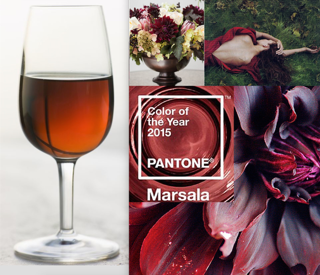
Marsala, the Pantone color of the year in 2015 is once again a controversial color choice. It has inspired conversation all over the internet from fashion and interior designers alike.
Named after the rich Marsala wine from Sicily and the warm Masala spices from India, Marsala was not initially one of my favorite colors! Mainly because I couldn’t really decide which color it was. It seemed to range from a pale fleshy brown peach to a rich burgundy wine color, and more.
As I’ve said before, Pantone color of the year is really more about a feeling, not an exact color. It’s a color that announces the “state of the union” per say. I think Marsala is a combination of a flash back to the 70’s earthy hippy tones, to a current day search for grounding…again a earthiness. And the range it runs is truly indicative of the mood of our global society. It is fluid, ephemeral and in a constant state of flux.
PANTONE Color of the Year is a reflection of what people are looking for, what they feel they need that this color can help to answer. Not necessarily the hot fashion color of the moment, but a color crossing all areas of design which is an expression of a mood, an attitude, on the part of the consumers.” via Pantone
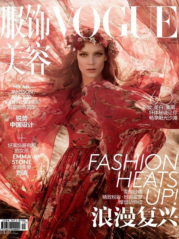
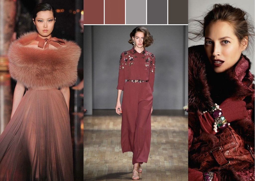
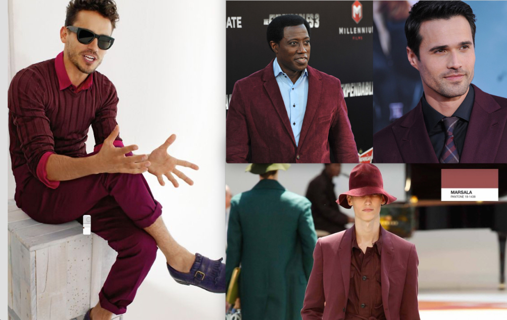
Marsala shades have been hot in the cosmetic industry for decades, think blush, lipstick and now, even eye shadows. And now it’s beginning to appear on the runways and the red carpet since 2014 in both men’s and women’s fashion.
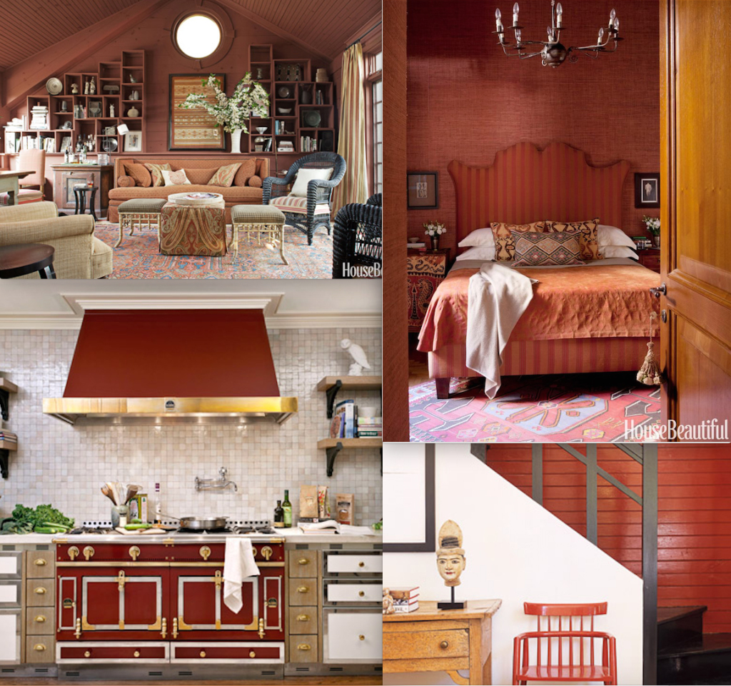
And, in the home it is popping up in all it’s forms as well. Here it’s more of a reddish brown, sometimes orange in feel, often with a note of caramel. As fellow interior designer Scott Meacham Wood said in his Harpers Bazaar article on interior design trends in 2015:
“I like to see that prediction as more about deeper hues and more vibrant colours! Look for deeper, darker colors—and more playful combinations of hues in interior design.” Harpers Bazaar
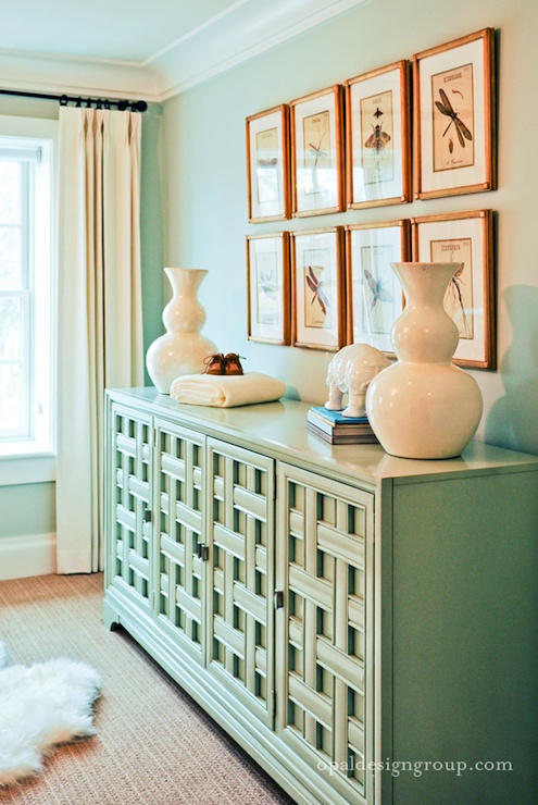
While Leatrice Eiseman of Pantone likes Marsala with the umber colors, I personally love it with the warm greige neutrals and with blues from powder blue to turquoise, cobalt and navy. That’s my favorite as it helps to balance out the feeling when combining a warm tone with a cool one.
While many companies select a color of the year, and mostly no two agree on the “one”, Pantone is the most influential. Why? Well, they serve the broadest range of businesses with their color services. From fashion, cosmetics, home and even paper companies, their word tends to be number 1 for the year.
What are your thoughts on Marsala now that it’s had time to settle in? Do you have an opinion you’d like to share? I’d love to hear them in the comments below!
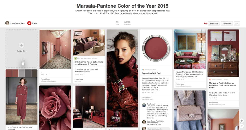
In the meantime, to keep up with how Marsala is being used and in what combinations, follow my pinterest board. I’d love to see you there! Cheers from Sonoma County.


