

Choosing color for your home can sometimes feel overwhelming. In this 4 part series I want to present the three aspects of color to consider when making your color decisions; the 4th part is how to actually select your paint colors.

Selecting color can be overwhelming-image via Rebecca Baumann
The first step, and what I consider the most important step. is to understand how color affects you, your mood, and helps to create a feeling in your home. I’m speaking about the psychology of color.
We’ve all experienced walking into a space that makes us feel uneasy, revved up or plain uninspired! And, we’ve experienced feeling calm, happy or just plain at home.
Every color has a vibration and, depending on your personality, can determine how you will react in a space with that color. It’s a vast subject, so this is simply an introduction to the concept. The best source, and my favorite, is a web site by color expert, Kate Smith, called Sensational Color.
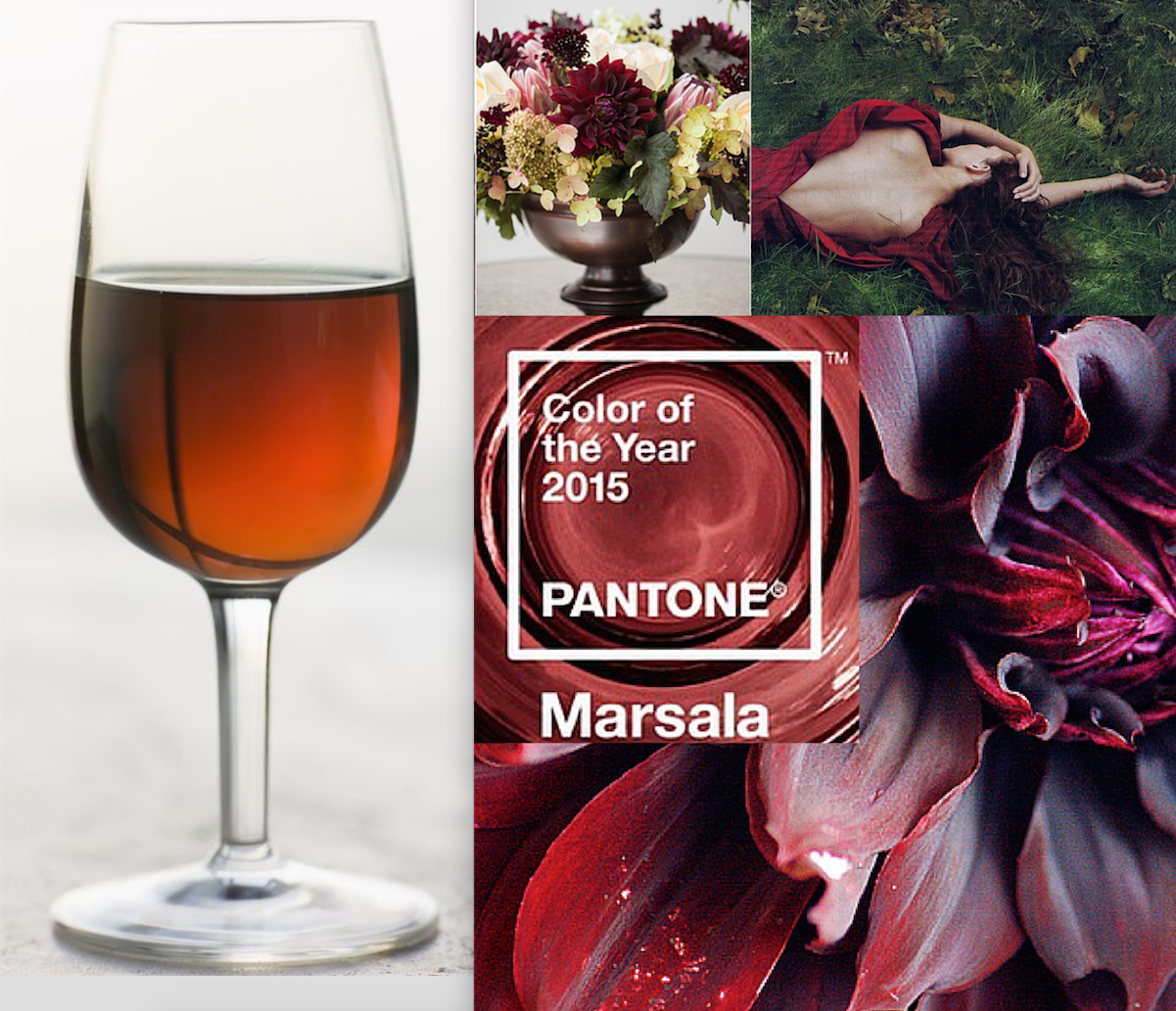
RED: it’s all about stimulation. So, don’t use it if you or anyone in your family has traits such as ADD or anger issues. And do, if you want to stimulate interaction, your mind etc!

RED-image via huamao on tumbler
PINK: it is the color of the heart and love; used for a feminine touch and to express innocence.

PINK-image via pink frosting
ORANGE: a close sister to red, but not as intense. Fun and enthusiastic; used to warm and activate a room, but not in a bedroom if you are having a hard time sleeping.

ORANGE-image via Brilliance on tumbler
YELLOW: Warm, sunny, inviting and sparks creativity; yellow with too much green in it can make you look and feel sallow or sickly.

YELLOW: image via Hot Polka Dot
GREEN: the color of spring, new beginnings, nature, ecology, and money. Green can stimulate all that, but with too much yellow in it, it can also make you look and feel sick like a greeny yellow.

GREEN-image via art.com
BLUE: cool and calming when light, brilliant when bright, and wise when dark, blue is a great color to help maintain a cool head and even body temperature. It’s not so good for people who are depressed.

BLUE-image vial beach bliss on tumbler
PURPLE: regal and creative, light purples can also evoke youth and spark creativity. Cool when it swings toward blue, vibrant when it swings towards red. The undercurrent in the color determines the feeling it creates.

PURPLE-image via vintage rose garden on tumbler
BROWN: in all shades has been THE neutral for the past 20 years. Earthy and warm, and all about organic, it’s negative effects can make you feel “muddy”.

BROWN-image via sunday in bed on tumbler
GREY/GRAY/GREIGE: the new, again neutral. Warmer then before, it’s sleek, classic and the perfect compromise, balanced as it is between white and black. Too much can be overwhelming for someone who is depressed.

GREIGE-image via tumbler on pinterest
WHITE: on one end of the color spectrum, it’s pure, clean, and invites you to declutter. To much white can feel stark and cold.

WHITE-image via adorable life on tumbler
BLACK: on the other end of the color spectrum, black can feel empty and void, it can also be cool and the perfect foil for every other color.

BLACK-image via zsazsa bellagio blogspot
I was invited a week ago to talk about color at a local paint store, Sebastopol Hardware. I videoed it, but the sound didn’t come out very well. So, I re-did it, editing and dividing it into 4 parts. Below is the first part, more in-depth then what I wrote in this post. PLEASE…bear with me, as I’m just learning to use my flip camera, and how to edit with iMovie! And boy, can we be our own worst critic. But it’s a start, and one of my goals for this year! I hope that this information will help you to see how the colors you choose for your home can affect you and all who enter your home.
If you have any questions, comments or thoughts, I invite you to share them in the comment section below! I love all conversations about color.
And stay tuned for part 2 of 4 parts to come out next Tuesday. While part one is all about the color, part 2 is all about you. I hope to see you there.
Comments
Related Articles


18 Comments
-
not easy huh!? took me 2 days before I got even a little comfortable looking at that little eye there!
great job. Lynne
-
Author
Oh you made me laugh out loud Lynne! NO, it’s so not easy which is why I was so impressed by your videos. My biggest downfall is I don’t have good lighting for video in my home. What with all the color on my walls, and I use a flip camera, not great. We also have so many windows, which I love, but that’s definitely not great for video. So, I’m working on it. Yours just seem so effortless…and I know how hard that is to do. You are one of my role models.
-
Pingbacks
-
[…] information, along with the understanding about how color affects you as discussed in part 1 will combine to set you on your way to selecting the colors that best represent you for your […]
-
[…] the trends, along with understanding how color affects you, and noticing where you can find your color inspiration are the three main points of view to think […]
-
[…] lives there and how they want to feel in their space and what colors they look good […]
-
[…] all know that color can stimulate a mood, lift the spirit, and set the stage for whatever feeling or statement you want to […]
Trackbacks
-
websites to watch tv shows online…
[…]Choosing Color for Your Home-Part 1 of 4-Psychology of Color | Irene Turner "Little Bits of Beauty™"[…]…
-
free tv shows to download…
[…]Choosing Color for Your Home-Part 1 of 4-Psychology of Color | Irene Turner "Little Bits of Beauty™"[…]…
-
download tv shows mp4…
[…]Choosing Color for Your Home-Part 1 of 4-Psychology of Color | Irene Turner "Little Bits of Beauty™"[…]…
-
download tv shows hulu…
[…]Choosing Color for Your Home-Part 1 of 4-Psychology of Color | Irene Turner "Little Bits of Beauty™"[…]…
-
how to watch free online tv shows without downloading…
[…]Choosing Color for Your Home-Part 1 of 4-Psychology of Color | Irene Turner "Little Bits of Beauty™"[…]…
-
free tv shows prime…
[…]Choosing Color for Your Home-Part 1 of 4-Psychology of Color | Irene Turner "Little Bits of Beauty™"[…]…
-
Sites we Like……
[…] Every once in a while we choose blogs that we read. Listed below are the latest sites that we choose […]……
-
Great website…
[…]we like to honor many other internet sites on the web, even if they aren’t linked to us, by linking to them. Under are some webpages worth checking out[…]……
-
Blogs ou should be reading…
[…]Here is a Great Blog You Might Find Interesting that we Encourage You[…]……
-
Online Articles…
[…]The information mentioned in the article are some of the best available […]……
-
Links…
[…]Sites of interest we have a link to[…]……
-
Its hard to find good help…
I am constantnly proclaiming that its hard to get quality help, but here is…