As an ex trend director and current interior space designer, I love watching what is happening to color. While fashion usually leads the color trend frontier, we can also take muse from other resources and social influences such as the celebrity and media world, technology, healthy food and wellness influences, graphics, packaging, international culture and more. By being aware of the different aesthetics around you, you will see color exploding everywhere!
Traditional color hues are rapidly becoming a concept of the past. Looking drab and dreary are the earth tones and jewels of the 20th century, and new are show stopping colors that grab your attention and move you to smile. Color in all forms have a definite vibration. And color is the quickest and most inexpensive way to change the mood of a room, update the look and freshen up the energetics of your space™. Here are 6 trends to keep your eyes on as we move further into the 21st Century:
- Colors in general are lightening up
- They are cleaner and less muddy looking
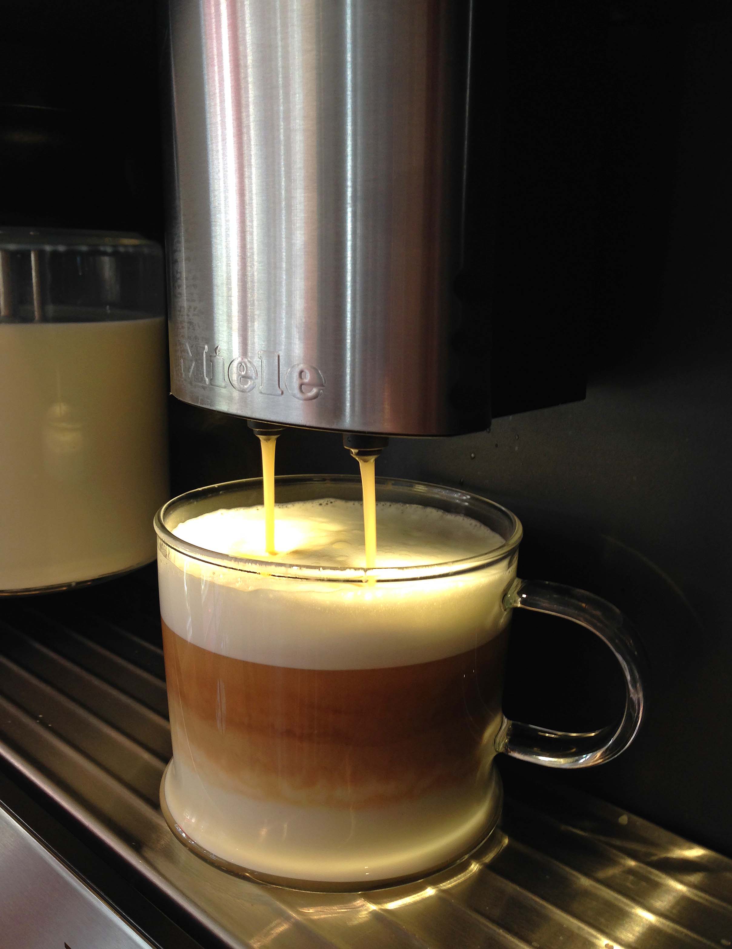
- Watch for a pearlescent or translucent feel to color…almost a milky finish
- Metallic accents aided by technology become more mainstream, adding a feeling of luxury and refinement
- Grays, with a warm touch of brown or of violet, draw inspiration from minerals, concrete and steel and become the new neutral, looking fresh as they add an almost chalky quality to other colors they combine with
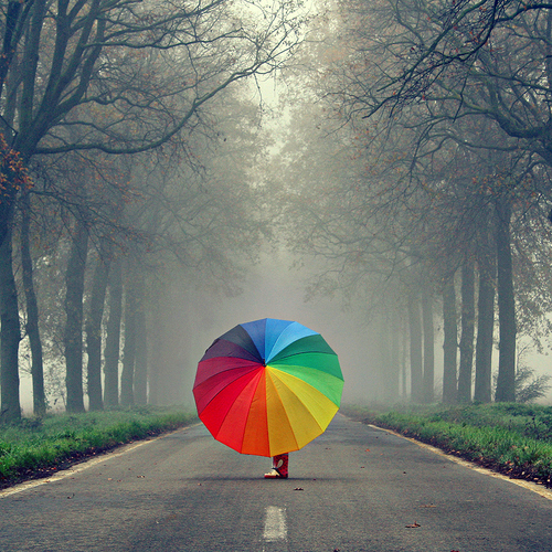
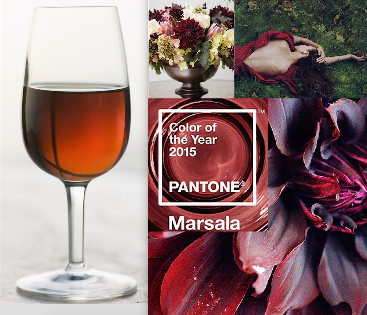
- Watch for show stopping color such as turquoise and cobalt, coral or orange, raspberry to pinky reds, lavender and violet, plus, limey yellows to pop a room. Think citrus!
As it is almost impossible to change your entire decor in one fell swoop, begin by adding accents…pick one of your colors and bring in the pop version of it to layer into a room. Next time you go to paint, pick a cleaner lighter version of what you are use to. Begin to push the envelope with how you mix your color combinations. And, as with anything new it will take awhile for your eye to grow accustom to this fresh, new and vibrant look. I call it…the Incredible Lightness of Home!
What do you think of this new direction…and can you think of anyway you could begin to switch color in your home or place of business?
Comments
16 Comments
-
Hi Irene,
How are you? From you blog and postings on FB, things seem to be going well. I love your blog and the images on your website are beautiful. Many of the folks who buy our furniture would love to hear about you so I’d like to link your blog to mine. In the meantime, check out what I’m doing in Petaluma with our Red Umbrella Consignment. Lots of furniture and clothing as well.
Stop by sometime. 120 A Kentucky St., Petaluma, CA 94952
-
P.S. our blog address is redumbrellaconsignment.blogspot.com
-
Author
Hi Dana, I don’t know why I didn’t realize you were in Petaluma…WOW. I’ll have to stop by sometime to see you as we are almost neighbors. Love your website and am now a fan of Red Umbrella. I saw people joining, but didn’t know what it was…it’s great.
Hope to see you soon.
Pingbacks
-
[…] paint your home…color as paint is the least expensive way to re-fresh the look and feel of a […]
-
[…] fields in a room. However, for many people neutral is the only way to go. Look for a re-surgance of grays (although warmer then before), and of course, earth tone neutrals continue to add a feeling of […]
-
[…] Why? I just LOVE the way this paint looks, feels and goes on the wall. In my blog post about color trends for the 21st century, I talk about colors having a pearlescent or translucent feel…almost a milky finish. And these […]
-
[…] that coral would be a great color for this next year…and yes, I’m feeling quite on target with that prediction. Because, I LOVE working in my home office, and visitors LOVE spending time here with […]
-
[…] unusual color mixes […]
-
[…] or tweet it into cyber space. I love the look as it has that milky finish I talked about in my color trends for the 21st Century post. And, when it’s a chalky black has an almost greige look to it which is of course, spot […]
-
[…] the grandmother of a baby girl, so it could be exposure? Or, perhaps it’s part of the trend towards the lightening up of color in general, and fun, show stopping colors to add pop to a room. Or […]
-
[…] turquoise! Sounds like a happy palette, doesn’t it? And part of the change we are seeing to color in the 21st Century. via Martha Angus Interior […]
Trackbacks
-
Online Articles…
[…]The information mentioned in the article are some of the best available […]……
-
You should check this out…
[…] Wonderful story, reckoned we could combine a few unrelated data, nevertheless really worth taking a look, whoa did one learn about Mid East has got more problerms as well […]……
-
Links…
[…]Sites of interest we have a link to[…]……
-
Sites we Like……
[…] Every once in a while we choose blogs that we read. Listed below are the latest sites that we choose […]……
-
Check this out…
[…] that is the end of this article. Here you’ll find some sites that we think you’ll appreciate, just click the links over[…]……

