

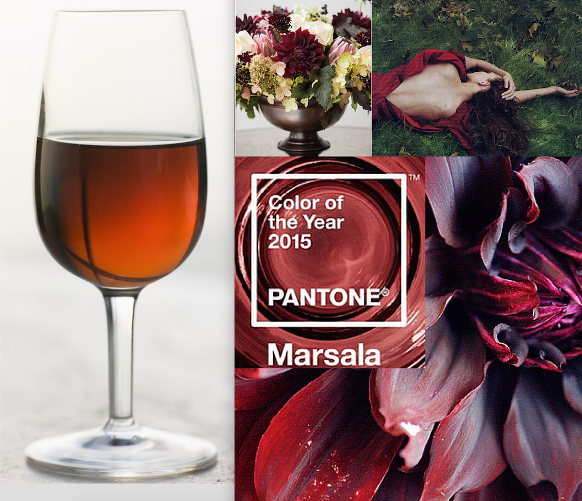
I’m excited to help a new client create a home and a new life in a loft space in San Francisco. Spending time with him and asking all sorts of questions I found out two facts to which I dedicate this post; while his favorite color is grey, he wants his home to feel warm. On the surface that could sound like an oxymoron, but can I tell you, it’s really not! Meet the new neutral, and one I believe will be the new neutral as we move forward into this second decade of the 21st century…Greige.

via google images
What is Greige? A colour between grey and beige, closely akin to taupe; Unfinished; not fully processed; neither bleached nor dyed. There is even a whole blog devoted to greige and it’s uses in interior design! Warm and wonderful, greige is the perfect neutral to mix with other fun and exciting pop colors such as turquoise, purples and golds. It warms up even more when mixed with all shades of brown, and this is the color story we decided to work with as the foundation in creating my clients new home. We plan to build off of this rug from Restoration Hardware. It’s the perfect combination of grey, brown and beige, which from a distance reads…greige. On top of bleached oak floors, mixed with carmel leather sofa’s and textures of steel, stone, cement and wood, his loft will end up being the bachelor pad he wants highlighting his favorite color in a warm way.

via Restoration Hardware
We’ll add a bit of an industrial edge, just because it is a loft and a trend that deals with reclaimed and recycled goods.

via garden, home and party blog
Add some comfort and cozy upholstery to soften the leather sofa’s; along with some rustic woods and …

via Cote De Texas

via Piet Boon 2
When we get down to accessories and art we will add splashes of color from shades of green to plums, rusts and that ever sunny yellow. I’ll update you as we get to that part of the project so you can see how well brights work with this modern neutral. Here’s an example of a pop of color in a basically greige room. Fab, don’t you think?

Elle Decor via Tobi Fairly blog
And, I love greige in fashion as well! With the Oscars coming up I could definitely see myself in this dress! From…Oscar de la Renta’s fall 2011 stunning collection.

Oscar de la Renta via NY Times
What are my favorite paint colors?

Farrow & Ball Pavilion Grey

Farrow & Ball Elephants Breath
What’s your take on Greige? Like it? Not? I invite you to leave me a comment and let me know what you think. If you don’t like it, what’s your favorite neutral?
Comments
Related Articles


24 Comments
-
Irene – I think greige is great in certain environments, especially in a loft. I personally would not use in my own home, I need a lot of color! But it’s a lovely neutral to build from. My own favorite neutral would have to be green!
-
Author
I too am a color person, at least personally and with most clients. But I do like this as a background to other bright colors as well. Thanks for stopping by Cynthia
-
-
Irene – I love the greige! I could see going all neutral or adding spots of color. Part of my problem is that I’m a bit schizophrenic when it comes to decor. I love color, but I also love the calming effect of an all neutral room. Purple is my neutral (and my new bathroom has none in it…) Oh, and it didn’t escape me that you referred to “that color” again (yellow).
Pat Zahn, Photo Solutions Superhero
http://www.PatZahn.com-
You make me laugh Pat, Yes, I spoke about yellow again. Actually purple looks fabulous against greige. And while I know that you have green in your bathroom, it did look greige in the pictures. So greige, is it your new neutral?
-
-
I have to say, a big fan of the greige as a base. It’s extremely powerful against colorful accessories… I do love the “industrial edge” trend. Very becoming.
-
glad you like! thanks for stopping by
-
-
Irene,
Hate to say this, but I do love the new Resto/greige look. Pops of color and interesting collection pieces do need to be added to complete a room, too much greige can go a long way. Soothing can soon become boring if you’re not careful! But I think it’s a great base to start with and then build up. New neutral with warm tones. We shall see!-
Totally agree about the pops of color, that’s why I can’t wait to get into the accessories and art part! My client has great art with lot’s of color, very exciting. Thanks for stopping by.
-
-
I’m also glad to see Greige coming to the forefront – lovely & functional.
There is a YouTube video about F&B’s Elephant’s Breath? It’s hilarious. I posted it on my blog and hope it’s okay to share.
-
Absolutely Lori, I love sharing! thanks for stopping by
-
-
I personally think that this is a fabulous neutral color which blends nicely with any color preferred! I would think if you add a color to accent, I would love to see a bright red or primary blue! It would add enough splash without taking away from the neutral background! Fabulous color!
-
It is a great color isn’t it Lynne? I actually can’t wait to get to the splash accent color portion of this project. I’m a color person at heart, and while I love a great neutral it only looks complete to me when mixed with color.
My clients art and accessories we are looking at are deep cranberry, russet, and all shades of green from chartreuse to teal. I’ll do an update later in the year when we get there.
Thanks for stopping by!
-
-
fantastic post,you hit the nail on the head there.
-
Some useful information across your site,will be back soon more another good read.
-
informative post,I’ll be checking back to this site for sure.
Pingbacks
-
[…] This post was mentioned on Twitter by Irene Turner, Irene Turner. Irene Turner said: http://ow.ly/3X9ki Greige is my new fav! I am a color person always, but do love greige as the best neutral #IntDesignerChat […]
-
[…] in my color trends for the 21st Century post. And, when it’s a chalky black has an almost greige look to it which is of course, spot […]
-
[…] also love their color. They are the perfect Greige, a great neutral for homes whether in paint or as an […]
-
[…] already written one blog on the fact that greige (a combo of gray and beige) is the new neutral of the decade. And, I’m incredibly pleased by […]
-
[…] Italian wool and alpaca chunky throw from Restoration Hardware. In wonderfully warm greige neutrals, this throw can fit in with almost any design style! Chunky Wool & Alpaca Throw from […]
-
[…] the New Neutrals are moving into mainstream kitchen design. And leading the color pack…Greige in all it’s divine […]
Trackbacks
-
Related……
[…]just beneath, are numerous totally not related sites to ours, however, they are surely worth going over[…]……
-
Recent Blogroll Additions……
[…]usually posts some very interesting stuff like this. If you’re new to this site[…]……
-
Great website…
[…]we like to honor many other internet sites on the web, even if they aren’t linked to us, by linking to them. Under are some webpages worth checking out[…]……