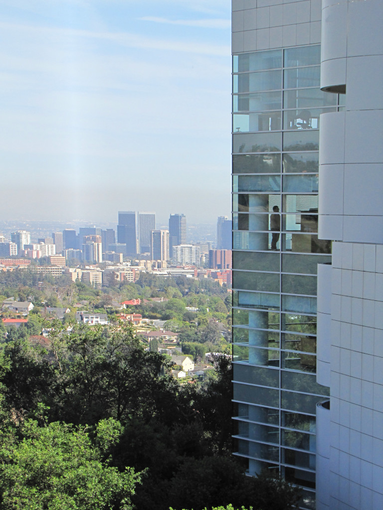
When the Getty Museum, located off the 405 in LA was being built, I thought it was a monstrosity. Big, hulking, monolithic, it seemed to loom over me as I traversed the crazy LA traffic on my way south from my lovely bucolic Sonoma County. Well…it’s still monolithic, square and somewhat hulking, but I’ve changed my tune completely! I recently went for my 4th or 5th visit, I really can’t remember all the times I’ve been there. The day was clear (as clear as you can get in LA) and the perfect temperature to spend the day enjoying this wondrous place designed by Richard Meier and Partners.
Richard Meier is a modernist, and his buildings tend to be square and bulky. But in spending time in the Getty, I have found there to be a peculiar sense of Grace that flows throughout based on much thought and engineering by Meier. Here are the three attributes of the buildings that I’ve grown to love and admire, and that contribute to its graceful feeling:
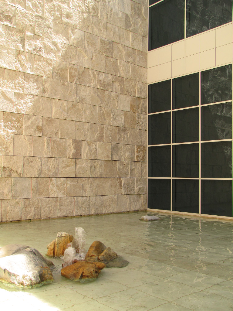
- The design is based on the square. While this may not be a surprise to some, it is the extent to which the square is consistently appliedthat is admirable. The basic square is 30 inches…the perfect size space for an individual to feel comfortable within. Every other square is a derivative of this basic 30 inch square.
- The light is magnificent! And I mean all of it. With the placement of windows, the way the buildings sit on the land, and the hidden or secondary entrances one stumbles upon, one thing is clear; the movement of light inside and out, changing as the sun moves through the sky…both throughout the day, and throughout the different seasons. This to me is the most clever aspect of the buildings by far!
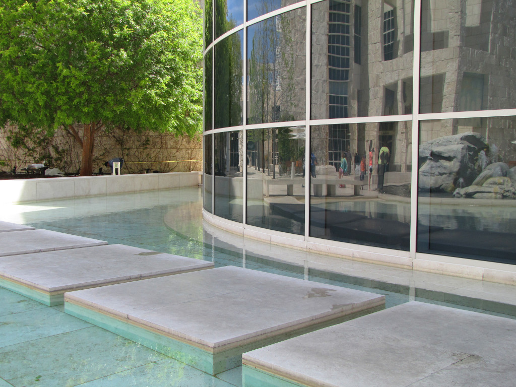
- And lastly, or third, is the reflective qualityof the buildings as a whole. Originally, Meier wanted the whole building to be white. I’m glad that the Getty powers that be prevailed and that while it has a lot of aluminum siding in a warm white, the stone is a warm, golden limestone. Otherwise the glare on a sunny day would have been unbearable. Never the less, the reflection comes from the materials themselves, and also from the water features that are integrated throughout, and every window and glass door that reflects the scene opposite it. Magnificent!
While I’ve loved the Getty gardens from the beginning, I’ve grown, over time, to love and appreciate the thought and the amount of detail that has gone into the buildings themselves. For the first time this past visit I took an architecture tour. The docent was enthusiastic and knowledgable. I highly recommend the 45 minutes. It’s incredibly informative.
Have you been to the Getty? Check out the video below for more views of this stunning museum. And tell me, what’s your favorite museum?
Comments
5 Comments
-
interesting article, I love these buildings
Trackbacks
-
Visitor recommendations…
[…]one of our visitors recently recommended the following website[…]……
-
Cool sites…
[…]we came across a cool site that you might enjoy. Take a look if you want[…]……
-
Cool sites…
[…]we came across a cool site that you might enjoy. Take a look if you want[…]……
-
Awesome website…
[…]the time to read or visit the content or sites we have linked to below the[…]……


