Pantone has announced their prediction of the color of the year as PANTONE® 18-2120 Honeysuckle. While Pantone Color Institute is the company that largely sets color standards for the fashion and home industries, personally, I don’t completely agree with them. And, having been a trend director and color specialist in the retail industry for 15 years, I think I can comment. “The reddish pink shade lights a fire to your senses and revs you up”, says Leatrice Eiseman, executive director of the Pantone Color Institute. “It’s much livelier than 2010’s color of the year: turquoise. That was supposed to have a calming, escapist effect on the public’s collective psyche after all of the bruising economic challenges, Eiseman says, but now we’re ready for something stronger while still not moving quite at full-steam ahead.” I do agree with all this. When I personally look at honeysuckle though, I say hmmmmmm, not…BUT…if you take this color and broaden it from rose, pink and watermelon, to coral and salmon, now I say that this RANGE of color is something to get excited about!
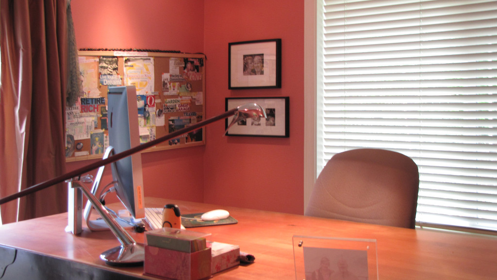
Earlier this year I traded offices with my husband and ended up painting my space Benjamin Moore: Coral Rock #32. I remember thinking at the time that coral would be a great color for this next year…and yes, I’m feeling quite on target with that prediction. Because, I LOVE working in my home office, and visitors LOVE spending time here with me!
Looking at the pink shades we sometimes referred to a healthy person as “in the pink”; content and happy people are described as “tickled pink”; pink is also known as the color of the heart and love; so it’s no surprise that pink is viewed as a positive color. Warm this color up with a hint of orange, and it turns it into coral and salmon. Now the color starts to vibrate with more energy, with feelings of balance, warmth, and enthusiasm. Personally, in this new economy we live in, enthusiasm, warmth etc…all are feelings I like to emphasize. And since I’ve moved into my new office, which is more of a coral or salmon shade, I’m feeling much more upbeat and I must say my mood is definitely more energetic!
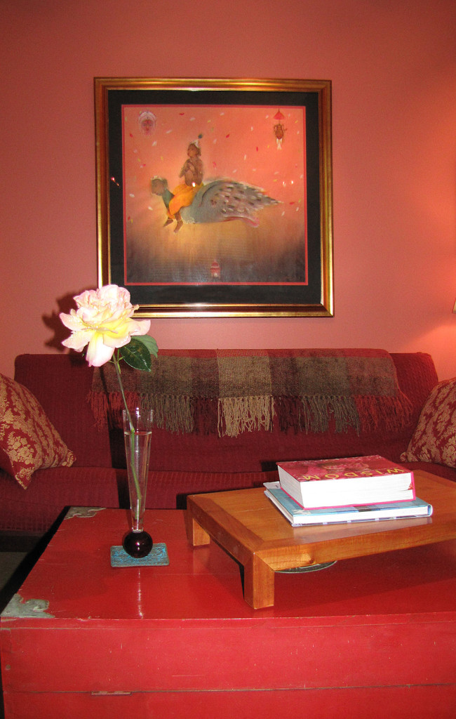
I also have to say I really like these warm tones when mixed with last years shades of Turquoise. It could be that the warm and cool shades in combination truly create a feeling of balance. And isn’t that something we all are striving for? I also love these shades mixed with plum, charcoal, navy and greige! Stunning in combination for sure.
Pantone is suggesting that we “Let the bold spirit of Honeysuckle ( I say change that to read “from honeysuckle to coral”) infuse us, lift us and carry us through the year.” And, I concur with that for sure. So ward of the blues by adding touches of these warm and fun colors through accessories, fabrics, paint and even in your wardrobe.
What do you say, do you feel your energy shift with the colors you surround yourself with?
For more inspiration check out the slideshow video below, and share these ideas with a friend!
Happy 2011
Comments
19 Comments
-
I much prefer your color of the year Irene. That Honeysuckle is far too bright for me. I really don’t like the inherited colors in our home but acnnot decide what I do want. Our main room is huge with really high ceilings and will cost a lot to get painted so we’ll be stuck with it for a while. Need to choose very carefully. Maybe I’ll start with our bedroom 🙂 I am tending towards the warmer colors…
Louise Edington
Facing Fears and Frontiers Over Fifty
http://louiseedington.com-
Author
I understand living with something until it really needs painting Lou. It can get expensive, but starting with your bedroom is a brilliant answer. Warm is good, especially where you live and in the winter! Make sure you “look good” in the color…ie; yellow can make some people (who do not have olive tonedskin) look sallow, same with greens. I think it’s important that we look and feel pretty in our bedrooms! ; )
-
-
As a clothing design professional I also saw that Pantone “blip” about “honeysuckle” and at first said- “ick, a mushy half there YELLOW?”- because that is what the WORD “honeysuckle” means to me- not some kind of “rose-y” shade. So I skipped right over the “press release” to be honest and forgot about it!
BUT READ your angle with total agreement! YES!
although their version of “honeysuckle” has a yellowish cast to it- and a lightness that makes you happy
I couldn’t agree more with- CORAL- I am all over it-especially for interiors- I kept reading…and hoping -in a second there- you were going to come to how FABULOUSLY it works with LAST YEARS’ TURQUOISE- and VOILA! and YES, indeed you did! Bring on Palm Beach prints, graphics and clear coral and turq! I can never get enough! Thanks for standing on your principles- and daring to “challenge” the “un-challengeable”- Pantone! -
Love this post Irene. Like Karen, Honeysuckle is a yellow orange to me so the two dont jive. I love coral. In fact have recommended it quite a lot to clients, and more pink coral too. So I am on the fence on this one. I do love the vibrancy of the warmer orange tones with turquoise. and I salute your stance. Here is to rooms & life with balance.
Jennifer Duchene
Home Makeover Mixtress
http://home-decorating-makeovers.com/ -
Any shade of pink looks good to me! Good “pairings” Irene.
-
Author
of course you like any shade of pink you heartbased and passionate woman you! : )
-
-
That’s not honeysuckle?! It’s more like Geranium pink. I like your warmer coral/salmon take (I look stunning in those colors – heh, heh!) I might have to find a way to work that into my house (or a scrapbook layout.)
Pat Zahn, Photo Solutions Superhero
http://www.PatZahn.com
Pingbacks
-
[…] This post was mentioned on Twitter by Irene Turner, Irene Turner. Irene Turner said: Didn't particularly agree with Pantone this year, so I tweeked the Color of the Year 2011: From Rose to Coral http://ow.ly/3p3hC […]
-
[…] shade of the touted color of the year, honeysuckle, I particularly love orange together with it’s complimentary color blue. From […]
Trackbacks
-
Superb website…
[…]always a big fan of linking to bloggers that I love but don’t get a lot of link love from[…]……
-
Websites worth visiting…
[…]here are some links to sites that we link to because we think they are worth visiting[…]……
-
Websites we think you should visit…
[…]although websites we backlink to below are considerably not related to ours, we feel they are actually worth a go through, so have a look[…]……
-
Awesome website…
[…]the time to read or visit the content or sites we have linked to below the[…]……
-
Superb website…
[…]always a big fan of linking to bloggers that I love but don’t get a lot of link love from[…]……
-
Websites you should visit…
[…]below you’ll find the link to some sites that we think you should visit[…]……
-
You should check this out…
[…] Wonderful story, reckoned we could combine a few unrelated data, nevertheless really worth taking a look, whoa did one learn about Mid East has got more problerms as well […]……
-
Sources…
[…]check below, are some totally unrelated websites to ours, however, they are most trustworthy sources that we use[…]……
-
Check this out…
[…] that is the end of this article. Here you’ll find some sites that we think you’ll appreciate, just click the links over[…]……
-
Superb website…
[…]always a big fan of linking to bloggers that I love but don’t get a lot of link love from[…]……

